New NI Deprivation Stats Out - The 'Rich List' for Funding
NEW DEPRIVATION MEASURES OUT FOR NI
New deprivation indicators are out this week, the first update since 2010. To some this is the equivalent of the NI Rich List, which area is the least deprived and which area is the most. Why does this matter?
Statistics show that those from more deprived areas will have worse health, life expectancy and economic opportunities. Many government reports now specifically refer to the performance of the most deprived 20% compared to the least 20% deprived. For example, the latest NI Health Survey 2016-17:
PRIORITISED RESOURCES
Public bodies, and other organisations, often look to prioritise funding and resources towards deprived areas. The ‘most deprived areas’ is now taken to refer to the top 20% of deprived areas as determined by NISRA (previously this was the top 15% under Targeting Social Need). When public resources are under pressure, pointing resources to areas of most need could be understood. The ‘Noble’ Deprivation Indicators are one way of ranking areas.
WHY ARE THEY CALLED THE NOBLE INDICATORS?
When deprivation indicators were brought in first in 2001, Professor Mike Noble was asked to advise on the methodology. Professor Noble led the Disadvantage Research Centre at the University of Oxford, and was the leading expert in this area. He created an approach that measured deprivation across seven indicators, sometimes referred to as domains.
- Access to Services
- Crime & Disorder
- Education, Skills & Training
- Employment
- Health & Disability
- Income
- Living Environment
These ‘Noble Indicators’ were based on a broad range of government statistics. Noble’s approach aligned with that taken in the UK and has continued to guide subsequent deprivation reports in 2005, 2010 and 2017.
WHAT ARE SOAs?
To allow comparison, NI had to be broken down into equal sized areas. For statistical and practical reasons, it was divided into 890 areas. These areas are called Super Output Areas (SOAs) and have a population of just over 2,000. SOAs follow electoral wards and numbered accordingly e.g. Crumlin 1, Crumlin 2 etc. SOAs can be subdivided themselves into Output Areas (OAs). There are 4,537 output Areas in NI comprising about 410 people each. Some government statistics cannot be granulated to this level and thus there is less specific information. Therefore, SOAs are the primary spatial and geographic unit for measuring deprivation.
WHAT IS NIMDM?
The seven Noble Indicators are converted into one standardised single measure called the Northern Ireland Multiple Deprivation Measure (NI MDM). This is a weighted average, with some domains (e.g. income) far more prominent than others:
NIMDM
Deprivation is comprised of Noble Indicators
The MDM is used to determine the relative deprivation ranking. An SOA ranked 1 under MDM, is considered the most deprived area in NI. The SOA ranked 890 is considered the least deprived. NISRA is careful to stipulate that this does not mean richest (most affluent) and poorest (least affluent) areas; and that SOAs can contain significant variations in deprivation. But, to many people they have crudely become a rule of thumb. Often funding will prioritise projects within the ‘most deprived areas’ before considering individual project circumstances of those not among the most deprived areas.
HOW IS DEPRIVATION SPREAD ACROSS NI?
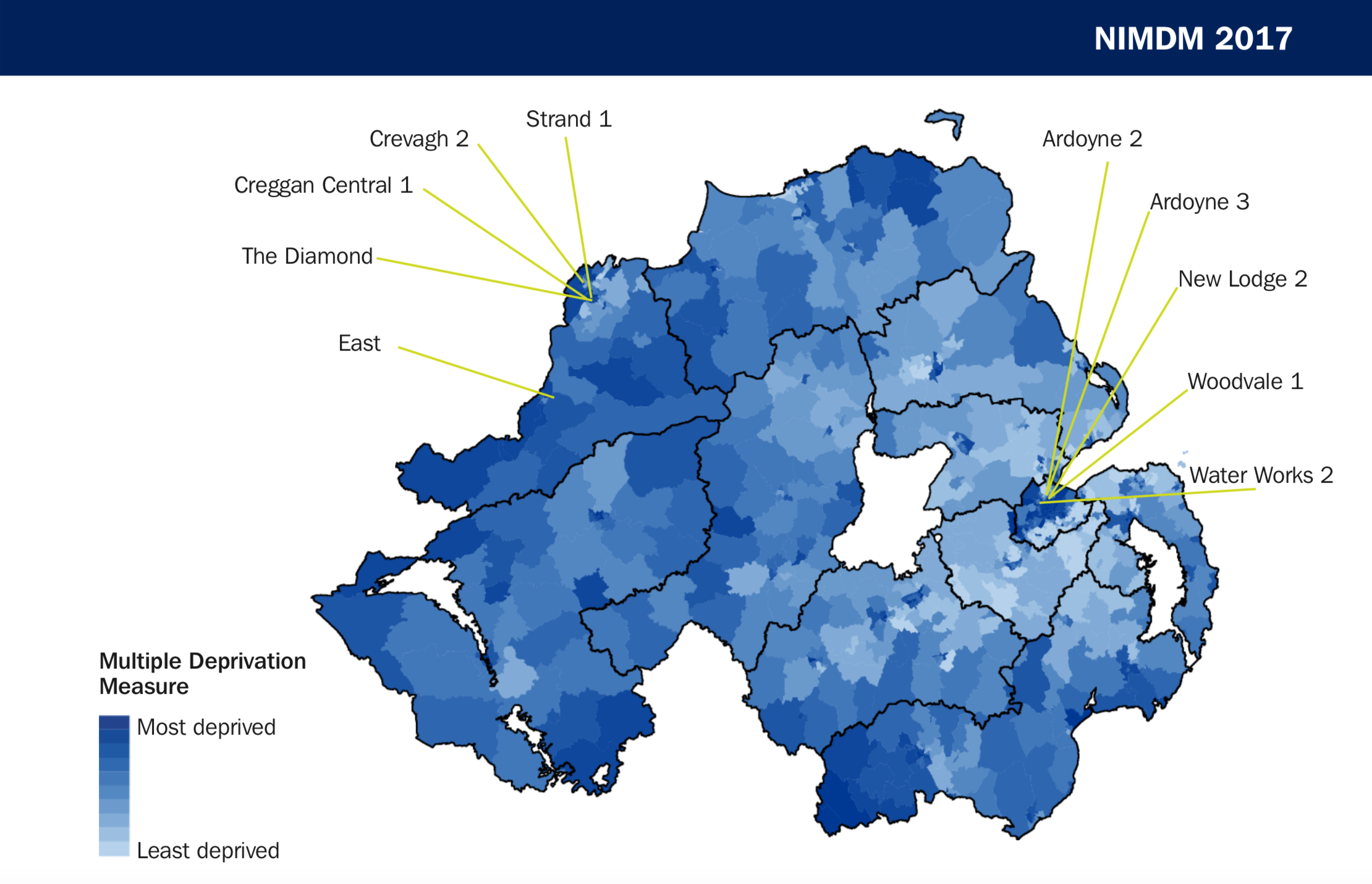
The map below shows the extent of deprivation, with the top 10 most deprived SOAs singled out.
Belfast (50) and Derry City & Strabane (20) councils have the most deprived SOAs. Lisburn & Castlereagh have no SOAs among the top 100 most deprived SOAs in NI.
DO THE MOST DEPRIVED AREAS EVER CHANGE?
From 2001 to 2017 the majority of the most deprived areas are the same. This does not mean these areas have not improved, it is just their relative ranking remains fairly constant. However, individual domains can rise or fall significantly, see below:
HOW DO I FIND OUT ABOUT MY AREA?
NISRA has a neighbourhood information service, NINIS, that provides a range of statistical information. Press the button below and then enter a postcode at the top of the page.
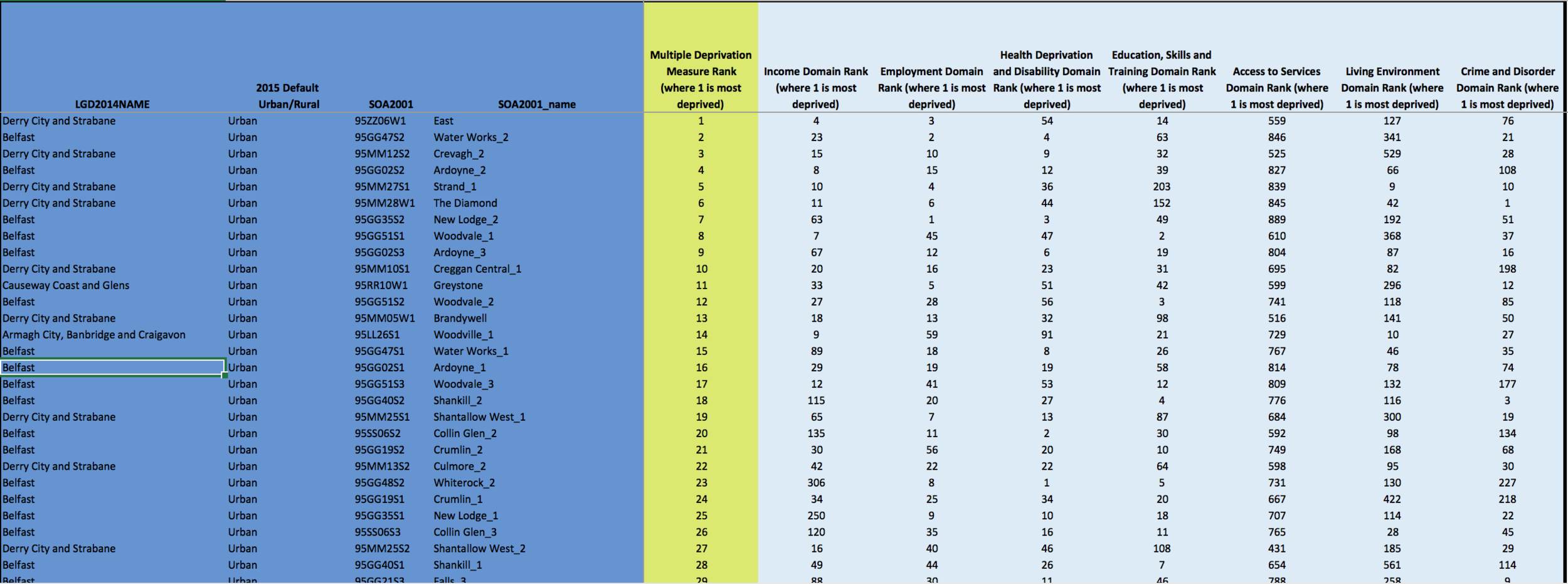
For more information on all 890 SOAs and their individual domain rankings, see below:
To learn more about your SOA or any other, we've ranked them alphabetically. Try using your electoral ward or local area name. If you still can't find it or are unsure, use the NINIS service above and it will provide you with the details.
This article will be expanded in due course and comes from McGarry Consulting's Policy, Research & Analysis Unit. Making things easier for local public, private and community sector.
McGarry Consulting


